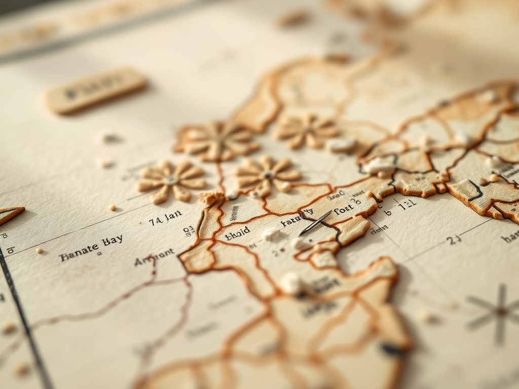
The smell of cold-pressed cotton paper hitting a fresh puddle of pigment is better than coffee on a Saturday morning. When you hold a heavy 300 GSM sheet in your hands, you feel the tensile strength of the interwoven fibers resisting your grip. This is the foundation of Hand Painted Map Art; it is a physical translation of your memories into a topographic masterpiece. We are not just doodling streets; we are engineering a visual legacy using fluid dynamics and structural layering. Your hometown is a complex grid of intersections and green spaces that deserve more than a digital print. It needs the grit of pigment and the precision of a jeweler's saw if you decide to go 3D. Grab your favorite drafting pencil because we are about to dissect your neighborhood block by block. We are looking for that perfect balance between capillary action and controlled brushwork to ensure your lines stay crisp and your colors stay vibrant for decades.
THE STUDIO KIT
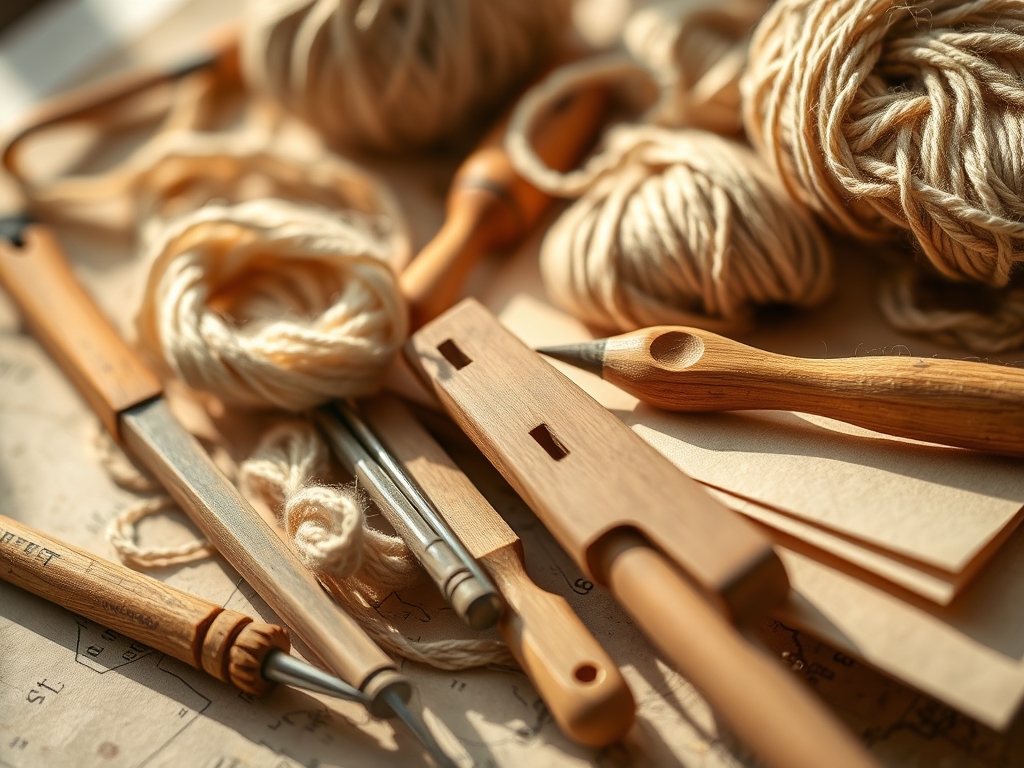
To master Hand Painted Map Art, your workbench needs to look like a cross between a scientist's lab and a fine art gallery. You need a self-healing cutting mat to protect your surface and a set of digital calipers to ensure your street widths are scaled accurately to the millimeter. For the base, use 140lb cold-press watercolor paper; the porous surface allows for deep pigment penetration without warping the sheet. Your brushes should range from a size 000 rigger for fine alleyways to a 1 inch flat for large bodies of water.
Material Substitutions: If you cannot find high-grade watercolor paper, a birch plywood panel sanded to a 220-grit finish works beautifully for a rustic look. Instead of professional gouache, you can use highly pigmented acrylics thinned with a flow improver to mimic the transparency of watercolor while maintaining a permanent, waterproof bond. Always keep a bone folder nearby to crisp up your edges and an awl for marking precise intersections before the ink hits the page.
THE TEMPO
The "Maker's Rhythm" is all about respecting the drying times of your mediums. Expect to spend approximately 12 to 15 hours on a standard 11×14 piece. The initial cartography and sketching phase takes about 3 hours; this is the most mentally taxing part as you calculate scale. The base washes require 2 hours of active work plus 4 hours of passive drying time to ensure the paper fibers have fully contracted. Finally, the "Detail Sprint" takes 5 to 7 hours of high-intensity linework. Do not rush the drying; if you apply ink to a damp surface, the lateral diffusion will turn your main street into a blurry mess.
THE CORE METHOD
1. The Topographic Foundation
Start by mapping the primary elevations and water bodies using a light 2H pencil. This layer defines the structural integrity of the composition. Use your calipers to check the distance between major landmarks.
Mastery Tip: Understand hydrophobicity. If you want your rivers to look pristine, apply a liquid masking fluid to the water areas first. This creates a chemical barrier that prevents any surrounding land colors from bleeding into your blues.
2. The Primary Arteries
Trace the main highways and boulevards using a permanent archival ink. These lines act as the "skeleton" of your Hand Painted Map Art. Use a rolling ruler to maintain parallel lines for wide avenues.
Mastery Tip: Use a high pigment load ink. Cheap inks contain fillers that can fade under UV light. Carbon-based inks bond at a molecular level with the cellulose fibers of the paper, ensuring the map remains legible for a century.
3. The Neighborhood Grain
Fill in the residential streets using a lighter gauge of pen. This is where the texture of the town starts to emerge. Think of this as the "connective tissue" of your artwork.
Mastery Tip: Pay attention to the grain direction of your paper. Drawing "with the grain" results in smoother lines, while drawing against it can cause micro-splatters if you use a nib pen.
4. Hydrology and Flow
Apply your first wash of color to the lakes and rivers. Use a wet-on-wet technique to create natural gradients that mimic deep and shallow water.
Mastery Tip: This is all about surface tension. By pre-wetting the paper, you allow the pigment to float and settle into the "valleys" of the paper texture, creating a three-dimensional effect without adding physical height.
5. Green Space Saturation
Layer in the parks and forests using varying shades of sap green and ochre. Avoid flat colors; real landscapes have chromatic variance.
Mastery Tip: Use stippling with a stiff hog-hair brush to create the illusion of canopy density. The physical impact of the bristles creates a micro-crater in the paper that holds more pigment, adding "visual weight" to the parks.
6. Architectural Footprints
Carefully block in significant buildings or your own home. This adds a personal tactile element to the map. Use a ruling pen for ultra-sharp corners on industrial buildings.
Mastery Tip: Consider the lightfastness rating of your paints. Reds and yellows are notorious for fading; choose pigments rated I or II on the ASTM scale to keep your childhood home looking bright.
7. The Vellum Overlay
Add a semi-transparent layer of vellum or a thin glaze of white paint to represent fog or high-altitude clouds. This adds a "ninth layer" of atmospheric depth.
Mastery Tip: When adhering vellum, use a dry adhesive or a bone folder to burnish the edges. Liquid glues will cause the vellum to cockle due to its low moisture resistance.
8. Typographic Precision
Hand-letter the street names and landmarks. This requires a steady hand and a low-viscosity ink that flows consistently from your pen.
Mastery Tip: Use a bridge or a steady rest for your hand to avoid smudging the previous layers. This is a classic drafting technique that prevents body oils from transferring to the porous paper surface.
9. The Protective Seal
Apply a final fixative spray or a thin layer of wax polish to protect the surface from oxidation and dust.
Mastery Tip: Choose a matte finish to prevent glare. A glossy finish can distort the fine linework of your Hand Painted Map Art when viewed under studio lights.
THE TECHNICAL LEDGER
Maintenance & Longevity: Keep your map out of direct sunlight. Even with high-quality pigments, UV radiation can break down chemical bonds over time. Frame your work using acid-free matting to prevent "acid burn" which yellows the paper edges.
Material Variations: For a premium version, use heavy-weight 640 GSM paper which is nearly as thick as a board. For a sustainable approach, use recycled hemp paper, which offers a unique, rugged texture and incredible burst strength.
The Correction:
- The Ink Blot: If you drop a blob of ink, do not wipe it. Use a clean, dry paper towel to "wick" the moisture up vertically, then use an X-Acto blade to gently scrape the dried residue.
- The Warped Page: If your paper buckles, flip it over, lightly mist the back with distilled water, and place it under a heavy stack of books for 48 hours.
- The Bleed: If a color runs, use a "magic eraser" or a damp stiff-bristle brush to lift the pigment before it sets into the fibers.
Studio Organization: Store your maps flat in a map drawer or a large portfolio. Never roll a finished Hand Painted Map Art piece; rolling creates mechanical stress that can cause the paint layers to delaminate or crack.
THE FINAL REVEAL
There is nothing quite like the moment you pull the masking tape off the edges and see your hometown rendered in high-definition color. The way the ink sits in the grooves of the paper and the way the colors transition from the suburbs to the city center creates a physical record of a place you love. Your Hand Painted Map Art is more than a decoration; it is a technical achievement. It is a mix of cartography, chemistry, and pure creative soul. Now, hang it up, let the light hit those layers, and get ready to explain the "science of the streets" to everyone who walks through your door.
STUDIO QUESTIONS
What is the best paper for map art?
Use 300 GSM cold-press watercolor paper. It offers the best tensile strength and a porous surface that handles heavy ink and water washes without significant warping or fiber degradation during the layering process.
How do I prevent my ink from bleeding?
Ensure the paper is 100% bone-dry before applying ink. Use archival, waterproof pigment liners. If you are painting over ink, verify the ink is permanent to avoid lateral diffusion when re-wetting the surface.
Can I use a hair dryer to speed up drying?
Yes, but use the "cool" setting. High heat can cause the paper fibers to contract unevenly, leading to permanent warping or making the pigment dry too quickly, which results in unsightly "tide lines" on your map.
How do I fix a mistake in the linework?
For small errors, use a white gouache with high opacity to mask the line. For larger mistakes, a sharp scalpel can gently shave off the top layer of paper fibers, though this changes the surface texture.
What is the best way to scale my map?
Use a grid system or a digital projector to transfer your base layout. Using digital calipers allows you to maintain a consistent scale across the entire piece, ensuring your neighborhood proportions remain mathematically accurate.